
The English country colour palette is built on muted greens, deep aubergine reds and plaster pinks, with soft yellows, pale blues and warm stony neutrals in support. Walk through a well-loved English country house and it seems effortless: a soft green hall, a sitting room the colour of old plaster, a dining room in deep aubergine glimpsed through an open door.
That ease is carefully made, and it can be learned. Whether you are painting a single bedroom or an entire villa, here is our insider's guide: the colours that appear again and again, the exact paints we specify, and how to make them work together across a whole house.
This guide contains some affiliate links: if you buy through them, we may earn a commission at no extra cost to you.
What colours are used in English country house interiors?
The three colours you will find most often are green, red and pink. But almost any colour can belong in an English country house. What makes it English country is not the colour family. It is the version of that colour.
The English country version is almost always:
Muted. A little grey, a little earth, never clean or bright.
Softer than it looks on the chart. Paint reads far stronger across four walls than on a sample card.
Comfortable beside antiques, faded fabrics and brown furniture. If a colour fights a mahogany chest of drawers, it is the wrong version.
The quickest way to train your eye is to see the right greens, reds and pinks side by side, which is what the rest of this guide does.
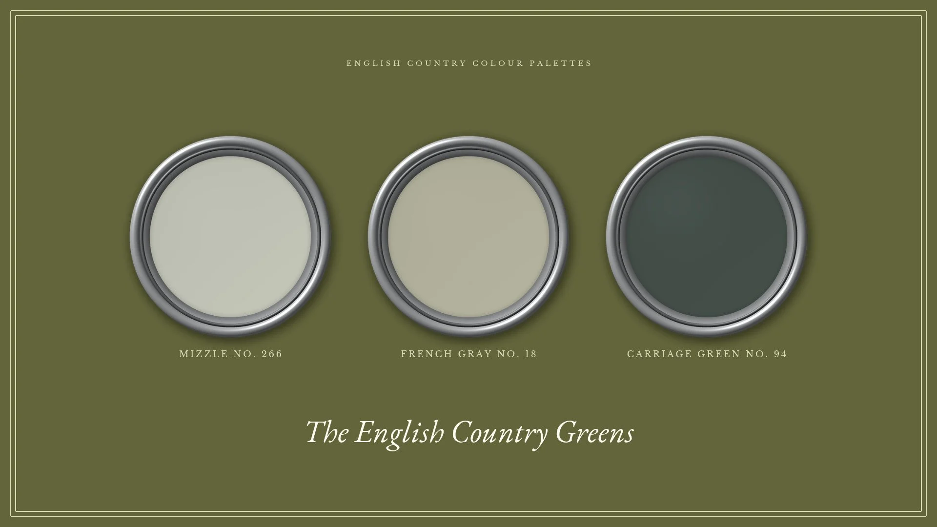
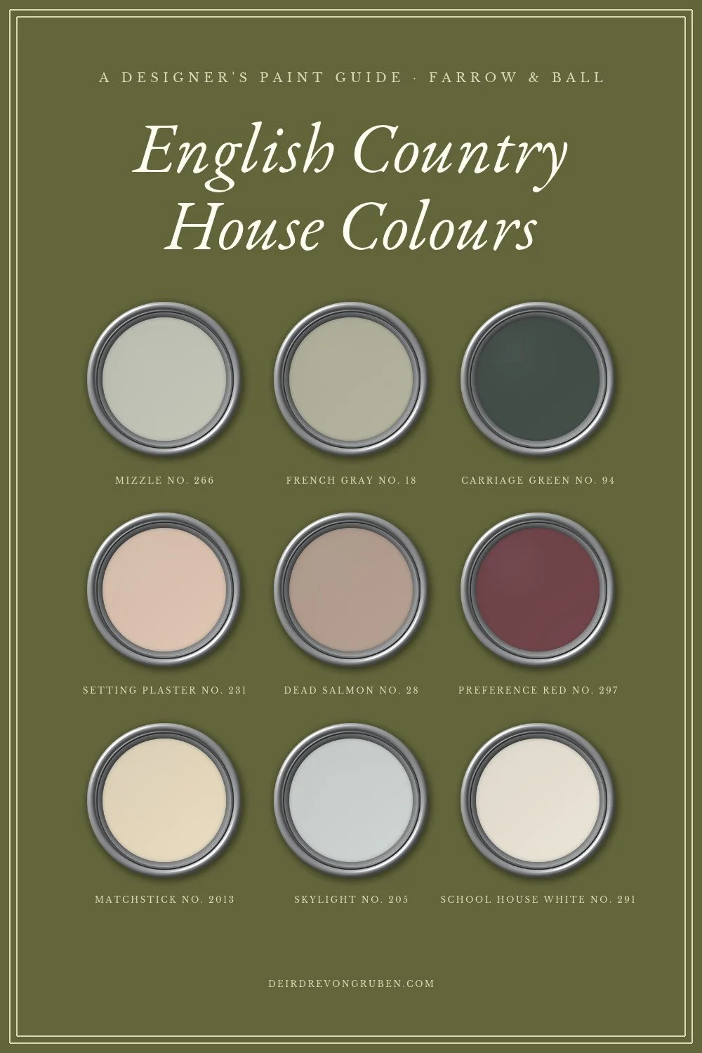
English country greens, light to deep: Mizzle No. 266, French Gray No. 18 and Carriage Green No. 94, all Farrow & Ball.
The best English country house paint colours, colour by colour
Green: the backbone of the palette
Green is the one colour you will find in every depth in an English country house, from barely-there sage to near-black. Yellows and pinks almost always stay pale. Greens go deep.
The light, muted "Cotswold" green
Travel through the Cotswolds and you will see this colour everywhere: on front doors, garden gates, fences and window frames. It is a pale, greyed green, and it is the single most useful colour in the palette.
It is also where we suggest most clients begin. If your rooms are currently white, a light muted green is the gentlest step into colour, and it sits happily with almost anything you put against it.
The versions we specify:
Farrow & Ball French Gray No. 18. Despite the name, a soft green. It is on the walls of The Dove, a bedroom in our own 1875 villa with almost no direct sun; you can see how it behaves there in our French Gray bedroom post.
Farrow & Ball Mizzle No. 266. A paler, softer neighbour.
Little Greene Boringdon Green (295), and Windmill Lane (296) if you want it a touch deeper.
Edward Bulmer Tea Green. The maker describes it as a grey-green that takes five pigments to balance, with a natural affinity for Georgian, Victorian and Edwardian rooms.
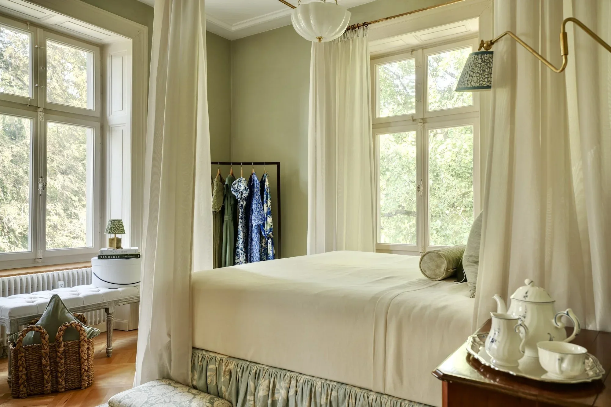
The Dove: walls in Farrow & Ball French Gray, with a Lewis & Wood Doves headboard.
Deep greens
For halls, libraries, boot rooms and joinery, we reach for the deeper greens. Choose versions with grey or black in them rather than bright, grassy ones, and use them in a flat, matt finish.
Farrow & Ball Carriage Green No. 94. An intense, dark green.
Farrow & Ball Chine Green No. 35. A dark, earthy, almost off-black green.
Little Greene Dark Brunswick Green (88). The dark fir-tree green that appears in so many English country interiors.
Our studio's view on the darkest greens: a colour this strong can easily become the main event in a room, and we rarely want the walls to be the biggest statement. The furniture, fabrics and pictures should share that role. On joinery, a door or a smaller room, though, it is magnificent.
Dark green walls in a country house smoking room by Salvesen Graham.
Red: deep and slightly purple
The reds we reach for most are deep and slightly purple: aubergine, claret and old brick rather than a bright tomato or post-box red.
The reds we specify:
Farrow & Ball Brinjal No. 222, a rich aubergine
Different makers, but strikingly similar in feel, and any of them will sit comfortably with antiques.
Where we use red. Most often on joinery rather than whole rooms: the cabinetry in a boot room, a kitchen, a bathroom or a library. On a whole room it is a confident choice. Their depth keeps these reds from shouting, which is why they are the ones we trust.
Pink: plaster, not nursery
The English country pink is muted, dusty and plaster-like, and it behaves almost like a warmer, more confident neutral.
Farrow & Ball Setting Plaster No. 231. The colour of freshly dried plaster.
Farrow & Ball Dead Salmon No. 28. Deeper, with a brown undertone.
Both are essentially stronger, warmer versions of beige. When a client wants more character than beige in a sitting room or drawing room, a pink like this is often our answer. It also fits beautifully into a house that is already largely white and green.
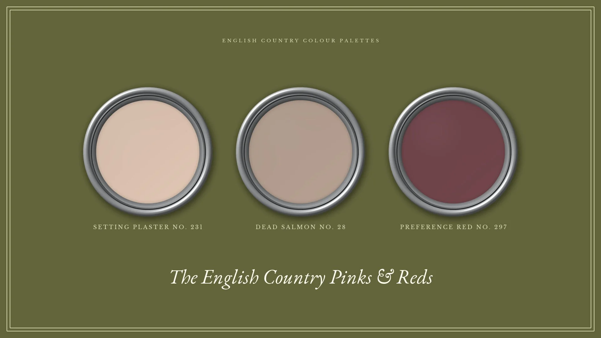
Plaster pinks to aubergine red: Setting Plaster No. 231, Dead Salmon No. 28 and Preference Red No. 297, all Farrow & Ball.
Farrow & Ball Dead Salmon on the walls of a Georgian drawing room by Charlotte Stuart Interiors, with Colefax and Fowler curtains.
Yellow: for rooms full of blue
Historically, yellow was used in English houses in far stronger versions than we use today. The softer yellows we reach for now:
The best reason to paint a room yellow is blue. If a room is full of blue fabrics or blue and white china, yellow walls are their natural partner.
Yellow walls with pale blue armchairs in a Georgian drawing room in Bath, by Sean Symington.
Blue: pale and muted
Blue was used historically in strong, jewel-like versions. Today we tend to use it pale and muted, such as Farrow & Ball Skylight No. 205.
We use it in two classic ways:
Blue and yellow. Pale blue walls beneath a pale yellow ceiling.
Blue and white. Think Delft tiles: pale blue walls, white woodwork and a few deep blue accents.
Neutrals and whites
For a room that calls for calm, the stony neutrals we like have a colour hidden inside them:
Lick Greige 02. A soft grey greige.
Little Greene Portland Stone (77). A stone with a soft green undertone.
Whichever neutral you choose, bring its hidden colour out elsewhere in the room, in a sofa or a pair of lampshades, so the neutral is never on its own.
For a white, our favourite is Farrow & Ball School House White No. 291: warm, soft and never stark.
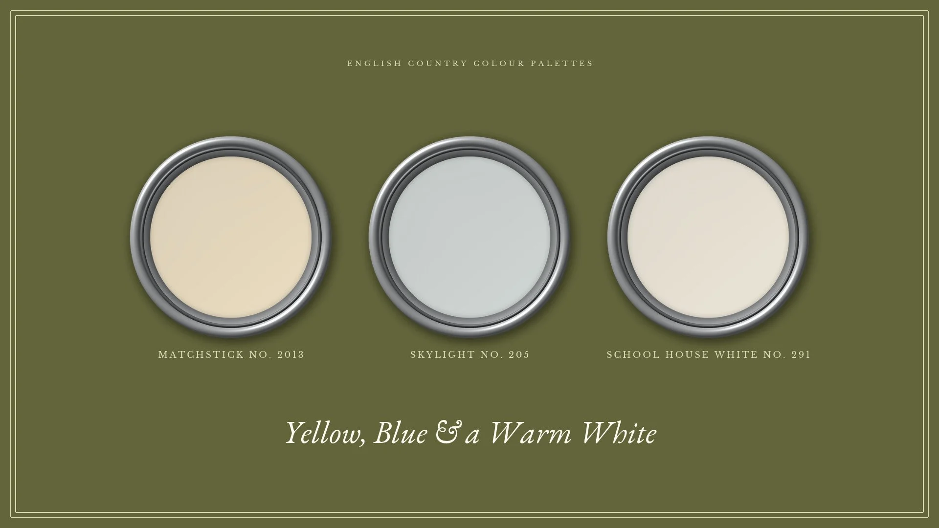
Yellow, blue and a warm white: Matchstick No. 2013, Skylight No. 205 and School House White No. 291, all Farrow & Ball.
Should woodwork and ceilings match the walls?
Our default is a warm white or cream on woodwork and ceilings. It is the most traditional and the most timeless choice, and it frames a coloured wall beautifully.
We only depart from it when there is a specific reason, usually one of three:
Colour drenching. Woodwork and ceiling in the wall colour, for a room that should feel enveloping and calm: a study, a snug or a small bedroom.
Statement trim. Doors, skirtings and window frames painted in a colour of their own, so the woodwork itself becomes a feature.
A coloured ceiling. A colour overhead as a deliberate contrast to the walls, when the room can carry it.
Sims Hilditch's Courtyard Room at WOW!house 2025 is a fine example of the third: a yellow ceiling over green screens and blue cabinetry.
Sims Hilditch's Courtyard Room at WOW!house 2025: a yellow ceiling over screens in Benjamin Moore Barefoot in the Grass and blue cabinetry.
How to build a colour palette for a whole house
This is where an English country house differs most from a modern home.
Why historic houses need colour to flow
Period houses are made of separate rooms, not open-plan spaces. But the doors between them are often placed symmetrically, one after another, so that from one room you look straight through into the next, and the next. This is called an enfilade, and it is one of the great pleasures of an old house.
It also means no room's colour stands alone. Each has to look right on its own and as part of the view through the house.
Rooms designed as one connected sequence, each with its own character: the view from the dining room into the kitchen of Sims Hilditch's South Kensington Family Home.
Use green as the connector
Green sits comfortably beside almost every other colour, which makes it the ideal connecting colour. Other pairings are harder; in our experience, blues and purples rarely sit easily side by side.
So for the spaces that link many rooms, such as an entrance hall, a landing or a staircase that rises through several floors, a green is usually our first choice. Every room that opens off it will look right beside it. The designer Martin Brudnizki has written about using green in exactly this way, to thread together a house of very different colours.
But don't paint every room green
Green is safe, but green in every room becomes monotonous, and the whole house starts to look like one scheme repeated.
When we design a whole house, ideally all at once, we find a separate starting point for each room, and we consciously look for one that isn't another green once green has appeared a few times.
Where a room's palette really starts
Not with the paint chart. A room's palette almost always starts with a rug, a piece of artwork or a fabric: the things that are hard to find, and that come only in the colours they come in. Paint can be mixed in any shade, so we choose it last, to suit everything else.
When I work with clients on a whole house, this is the order we follow: the rug, the artwork and the fabrics first, then the paint colours that tie each room to its neighbours. If you are planning a home in Switzerland, our Full Service Design brings this together room by room, from the first plans to the final installation. Wherever you live, our Online Design service delivers a complete scheme for a single room, paint schedule included.
The colour pairings we come back to
Some combinations appear again and again in English country houses, because each pair shares a muted, earthy undertone and so never fights:
Pink and red, one of the most frequent of all
Pink, red and green, our favourite three-colour scheme
Green and blue
Blue and white
Yellow and blue
Pink, red and green together: Farrow & Ball Setting Plaster walls, a green velvet sofa and a red rug, by LGW Designs.
Colour needs company. A single coloured object in an otherwise neutral room will always look out of place, however well chosen. We give every colour at least one partner elsewhere in the room, ideally from the pairings above.
How we balance a scheme. As a starting point we spread three colours in roughly a 60 / 30 / 10 proportion: about 60% on the walls, 30% on the large pieces (the sofa and armchairs, or the bed), and 10% in the details (cushions, lamps and lampshades).
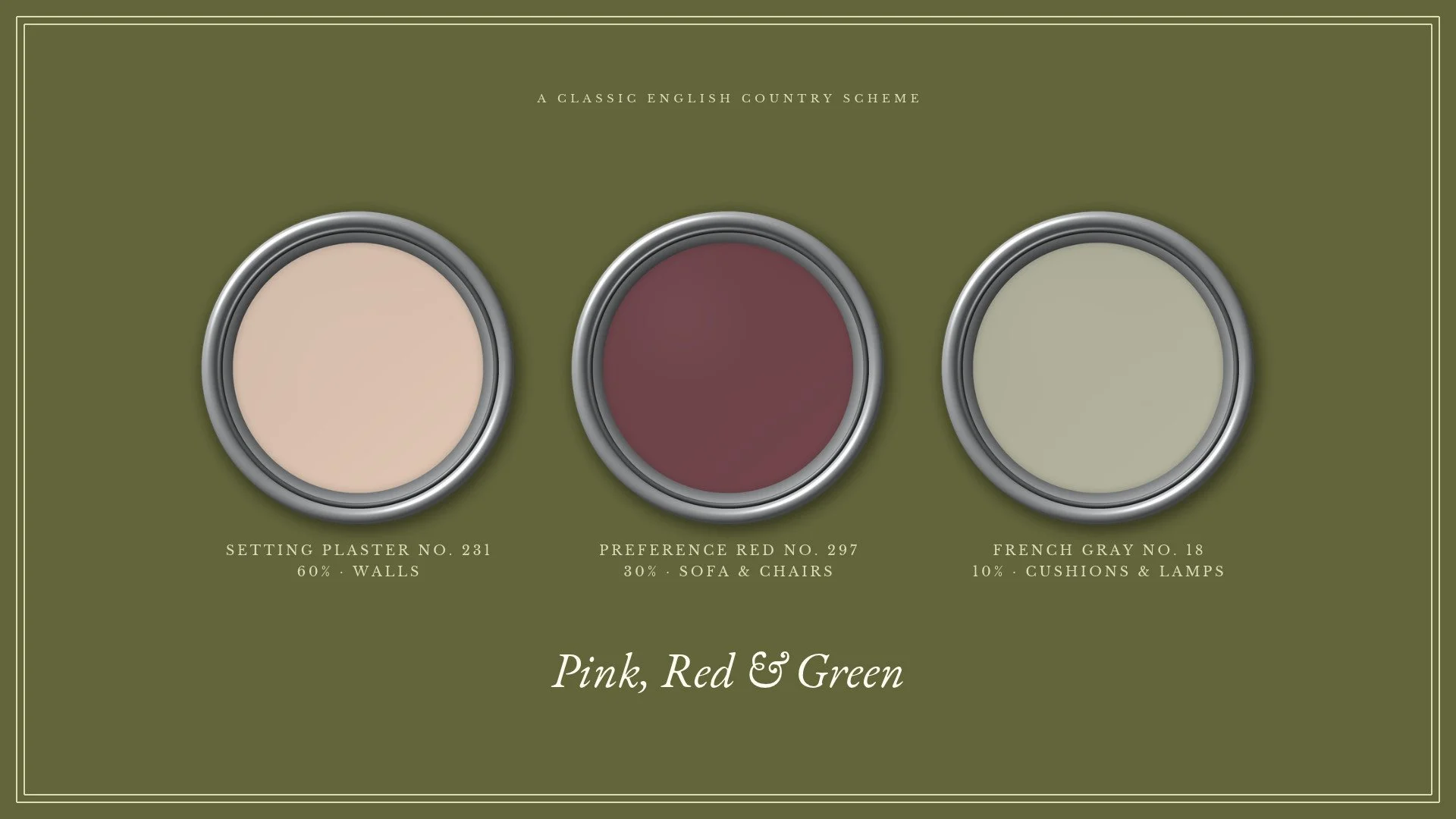
Pink, red and green in a 60 / 30 / 10 balance: Setting Plaster walls, a Preference Red sofa and chairs, and French Gray in the cushions and lamps.
How we test colours before we specify them
We don't specify a colour from a small chip. For every scheme:
We paint large boards of each candidate colour, rather than relying on small cards.
We place them on several walls of the actual room, because the same colour can look entirely different on the window wall and the wall beside it.
We look at them at several times of day, and alongside the room's fabrics and rug.
We allow for intensity. A colour that looks gentle on a sample can look many times stronger across a whole wall or a whole façade, and we judge the shade with that in mind.
Colour in a Swiss period home
A few considerations are particular to period houses in Switzerland:
Old plaster needs to breathe. In older villas and farmhouses with lime plaster, choose both the paint brand and the type of paint with care, so that the walls can still breathe.
Listed houses may need approval. If your house is protected, changes to some interiors may need the agreement of the cantonal heritage office (Denkmalpflege). We check this at the start of a project; on our own villa, we have been through the process ourselves.
Every brand here can be bought for Swiss projects. Each either ships to Switzerland or is sold here, so there is no need to compromise on the exact shade.
The paint brands we use, and why
We return to a small group of European paint companies:
Farrow & Ball
Little Greene
Edward Bulmer
Anna von Mangoldt
Lick
What they have in common is a curated range. Some paint brands offer thousands of colours, which makes choosing almost impossible. These makers offer a deliberately edited selection, so it is very hard to choose badly from any of them.
Edward Bulmer deserves a special mention for historic houses. Bulmer is an interior designer and architectural historian who has spent around thirty years working on Britain's historic buildings, including Althorp and Goodwood. He designs and mixes his own colours, using natural earth and mineral pigments in plant-based paints. His book, The Colourful Past: Edward Bulmer and the English Country House, is well worth reading.
Walls in Edward Bulmer Jonquil in a living room by Turner Pocock.
Anna von Mangoldt is a German maker with a small, beautifully judged range, though she is not very well known outside the German-speaking world. She is a friend of the family, and I always like to use her colours where I can, to support a fellow small business.
Frequently asked questions
What is the most popular English country house paint colour?
Green, and in particular a light, muted green such as Farrow & Ball French Gray or Little Greene Boringdon Green. It is followed closely by deep reds and muted pinks.
What colour should I paint a hallway in an English country house?
A green is usually the best choice. Halls connect many rooms, and green sits comfortably beside almost every other colour, so each room that opens off the hall will look right next to it.
What white goes with English country colours?
A warm, soft white rather than a brilliant one. Farrow & Ball School House White is our favourite for woodwork and ceilings.
Should I choose paint or fabric first?
Fabric first, along with the rug and any important artwork. Paint can be mixed in any shade, so it is chosen last, to suit everything else.
Bringing it all together
Done well, the colours of an English country house are never noticed on their own. You notice the whole: the green hall that welcomes you, a glimpse of a plaster-pink sitting room through an open door, and the deep red library beyond, each room clearly itself and yet unmistakably part of one house.
If you would like a palette like this for your own home, please do get in touch through Full Service Design for homes in Switzerland, or Online Design wherever you live.
Save this palette to Pinterest.