
To mix patterns well, start with one piece you love that holds several colours, then add patterns in different scales and different types, repeat the anchor's colours in varying depths, and give the eye a few plain places to rest.
Pattern is at the heart of an English country room, but mastering it takes practice. In this guide, we walk you through how we put a pattern scheme together, using The Dove, a bedroom in our own 1875 villa, as the worked example throughout, so you can follow the same principles in your own home.
This guide contains some affiliate links: if you buy through them, we may earn a commission at no extra cost to you.
Where does a pattern scheme start?
Almost every room we design has one jumping-off piece. It might be a rug, a hero fabric, a wallpaper, or occasionally a statement piece such as a painted chandelier. Ideally it is multicoloured, because a piece with several colours in it sets the room's colour scheme and its pattern scheme at the same time. Look for one with at least three or four colours.
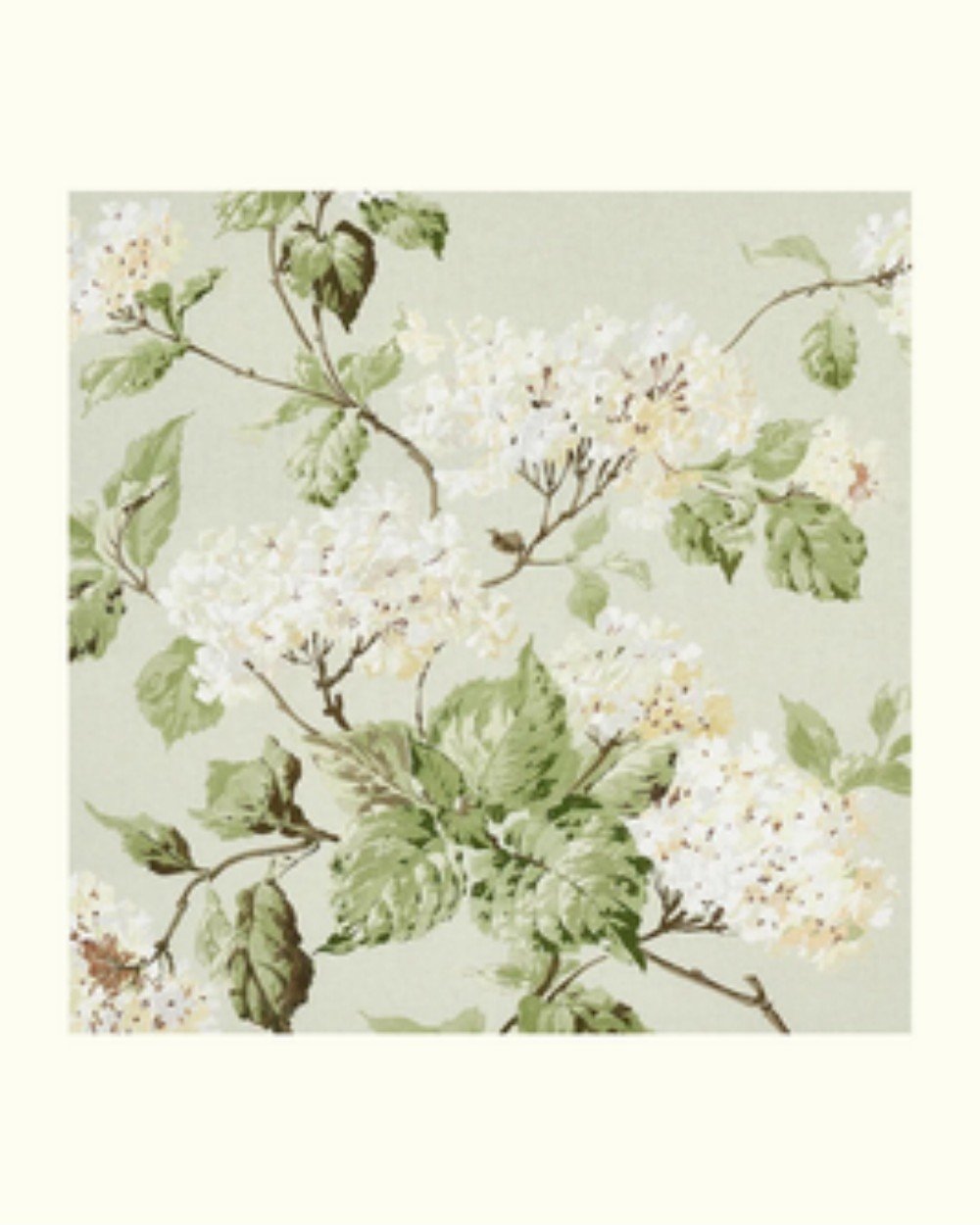
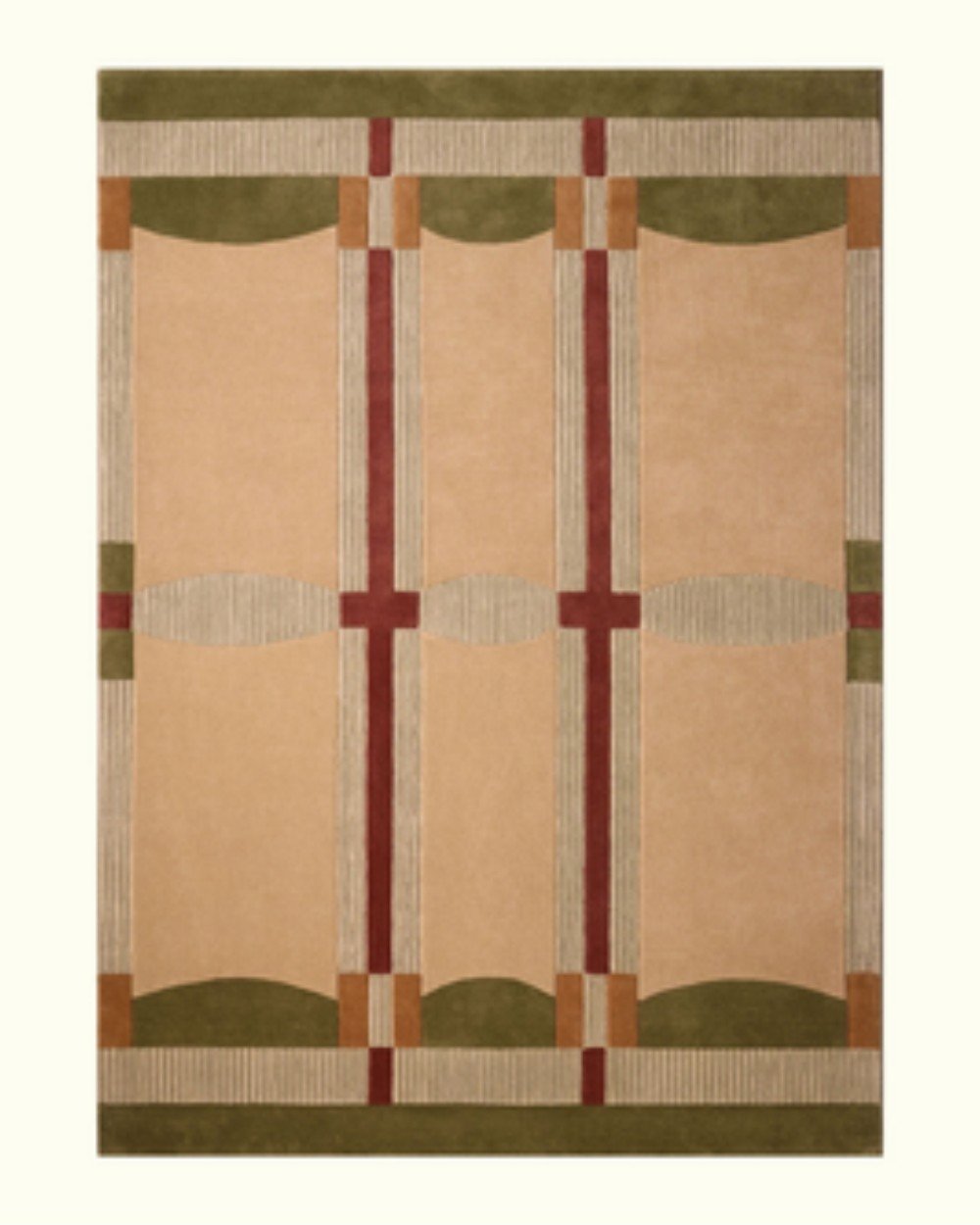
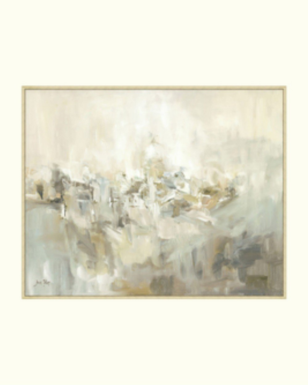
That first choice shapes everything that follows. If the starting point is a rug with a large-scale geometric pattern, the room already has its large geometric, so the other pieces need to bring something different: more organic patterns, smaller stripes, and some solids.
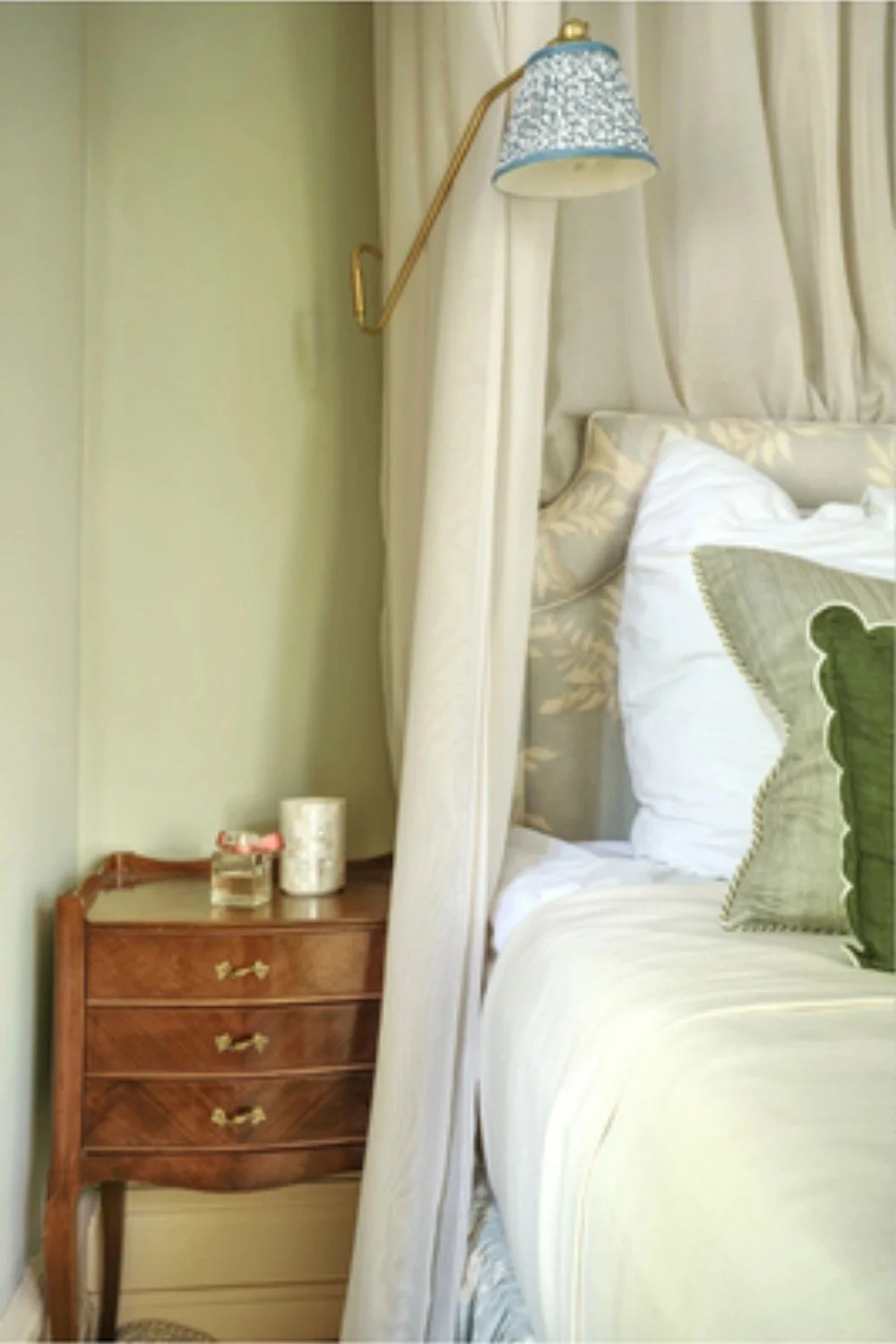
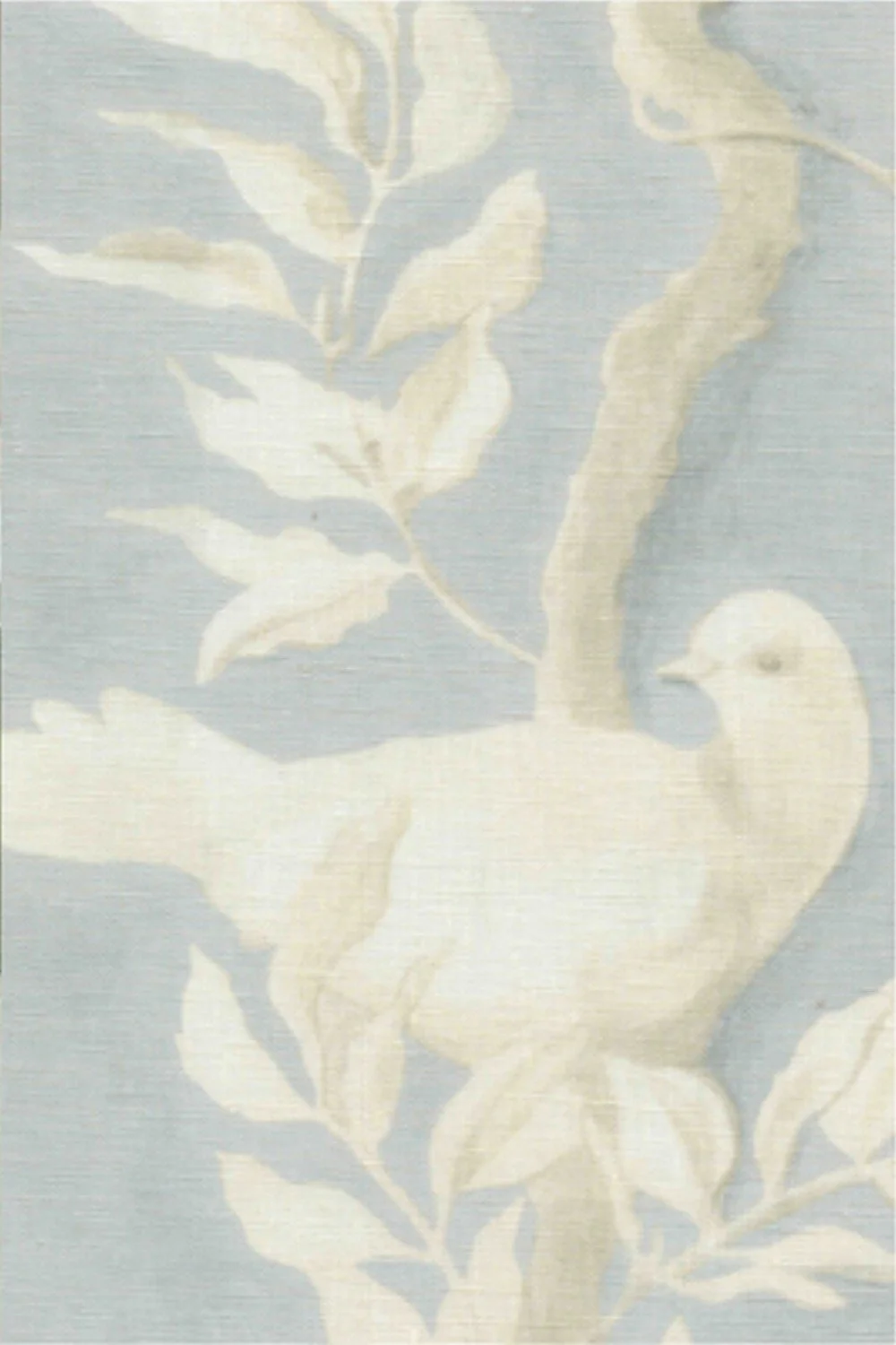
In The Dove, the starting point was the headboard fabric, Doves by Lewis & Wood in Summer Blue. Every other fabric in the room was chosen to sit with it.
Mix the scale: large, medium and small
Every room we design has large, medium and small-scale patterns in it. The balance between them is what sets the mood.
Weighted towards medium and large, with just a hint of small scale, a room reads as an English country house: generous and grown-up.
Weighted towards small scale, the same colours take on the gentler feel of an English cottage, or of a child's room.
Both are lovely; they are simply different moods. For a nursery or a child's room, we lean deliberately on small-scale patterns, still with some medium and large ones for structure. For a drawing room or a principal bedroom, we keep the small patterns to the details.
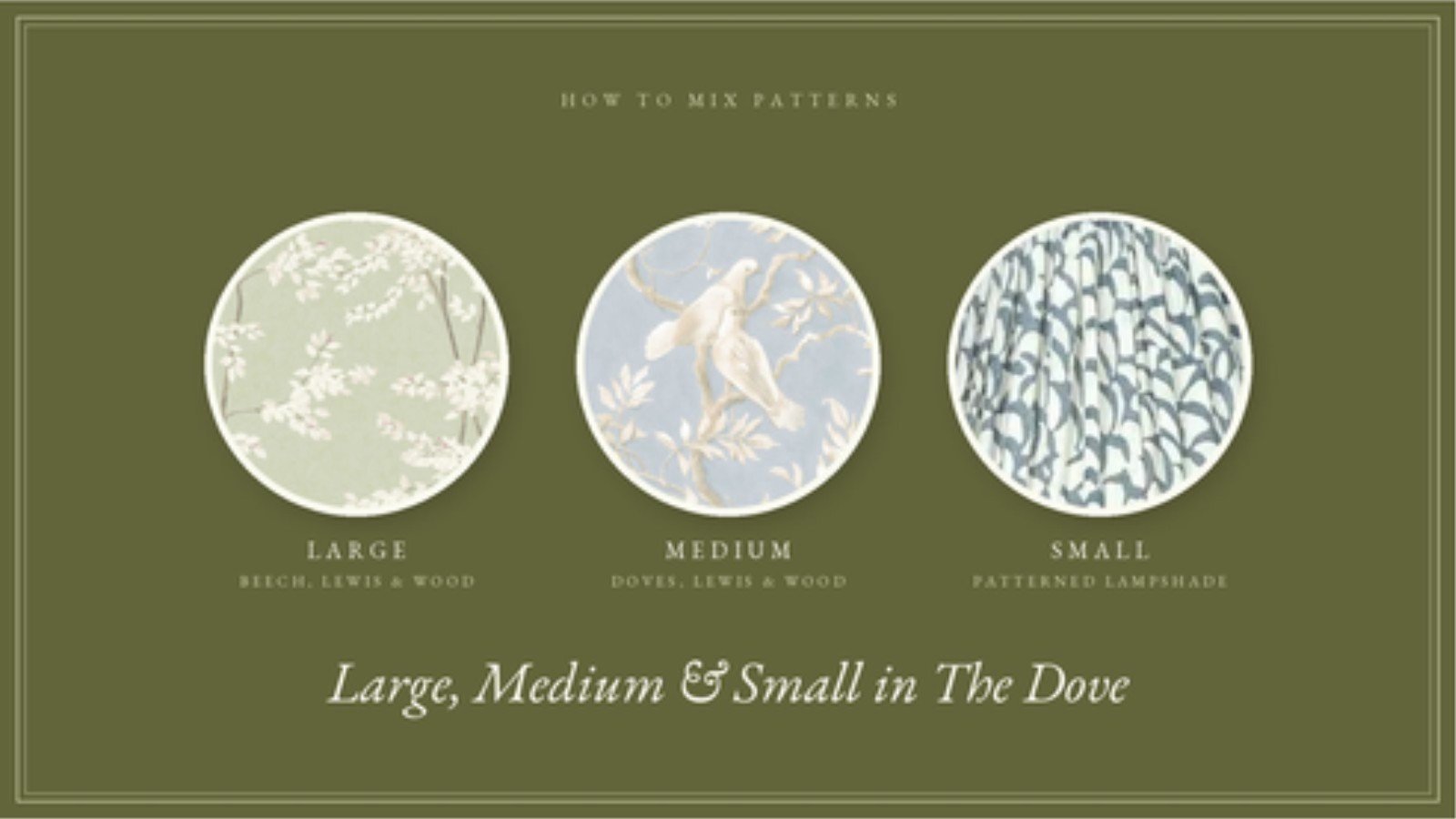
Large, medium and small in The Dove: Beech by Lewis & Wood on the tablecloth, Doves on the headboard, and a small-scale patterned lampshade.
Mixing pattern types in interior design
Scale is only half of it. The other half is mixing different kinds of pattern, so that no two pieces are competing to do the same job.
A floral. We almost always have one. Organic patterns such as florals, leaves and branches bring softness and movement.
A stripe. Stripes add structure, and they are one of the most useful patterns in the room. They are also among the most economical, which we come back to below.
A check or geometric. Checks, trellises and small geometrics, in small and large scales, give the eye something orderly beside the florals.
A toile, when it suits the room. A toile tends to set the theme of a room on its own, so we use it when that is the direction we want the whole room to take.
View this post on Instagram
Florals, stripes, checks and a small geometric on the sofa, all in one sitting room, by Salvesen Graham.
Two florals can share a room, as long as stripes, checks or geometrics sit alongside them.
Mixing traditions. English chintz sits very naturally beside Indian block prints, ikats and suzanis. This mix has deep roots: the fashion for chinoiserie was itself a European take on Chinese design, and England's long exchange with India brought printed cottons into English houses centuries ago. In a country house, these patterns look as though they have always been there.
How do you tie different patterns together?
Through colour. Our approach:
One piece holds every colour. The anchor, whether a fabric, a wallpaper, a rug or a painting, contains all of the colours in the scheme.
Every other pattern picks up some of them. A cushion might carry only one of the colours, a curtain two, a lampshade all three. As long as every colour appears in the anchor, the room holds together.
Use each colour in several depths. Repeating a colour in several depths is what makes a scheme look layered. In The Dove there is a light green and a dark green, a light blue and a deeper blue.
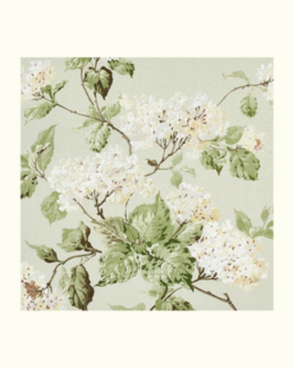
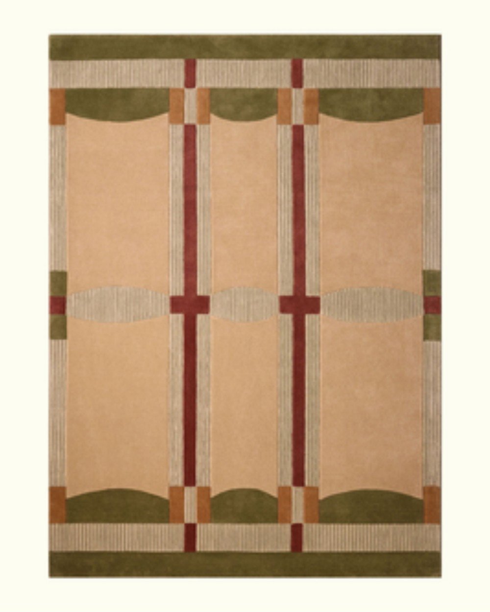
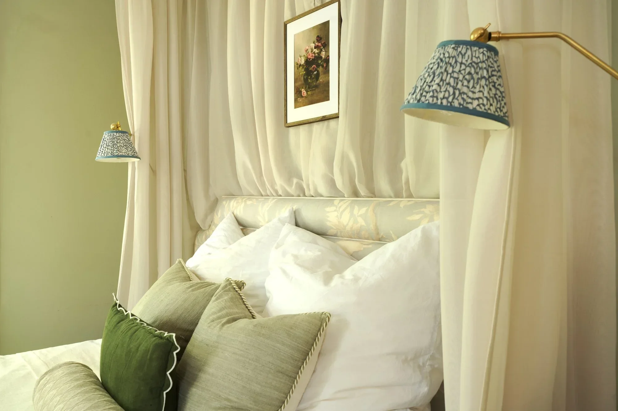
Green in two depths: light green cushions and a dark green scalloped cushion against the soft blue of Doves.
Exactly the same, or clearly different. Two colours that almost match but don't are the hardest thing to make look right. Matching a cushion or a wall colour to a sofa fabric from a different maker is nearly impossible, so we make things either exactly the same or intentionally different. When we chose the lampshades for The Dove, we passed over a light blue that nearly matched the headboard in favour of a much deeper blue, which sits beautifully beside it.
A palette of two neighbouring colours, such as the blue and green in The Dove, is the calmest and easiest to work with. A third colour used in small amounts, around 10% of the room, adds warmth: in The Dove, that is raspberry, in the plates on the wall and a few smaller pieces. For more on choosing the colours themselves, see our guide to English country colour palettes.
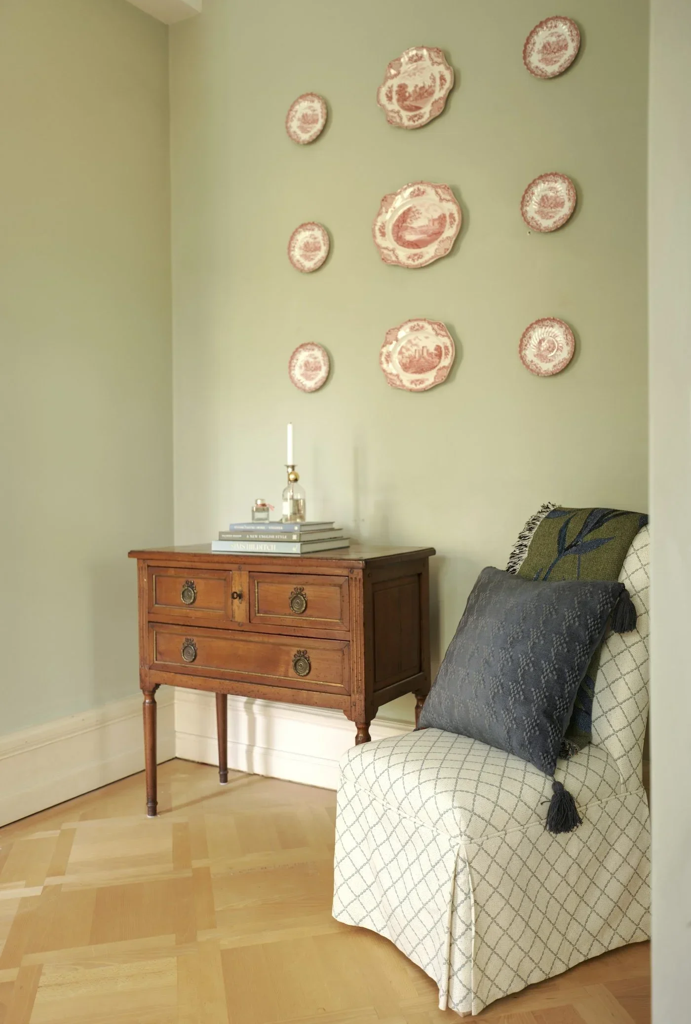
The 10% accent: raspberry transferware plates on the wall of The Dove.
Give the eye somewhere to rest
Plain fabrics and textures are not an absence of design; they are what lets the patterns read. Linen, velvet, wool and silk in solid colours act as resting places between the patterns. In The Dove, the bed canopy is a plain voile, because one more pattern above the bed would have been too much.
Spread the pattern around the room
Spreading pattern around the room, rather than gathering it in one corner or all on the bed, lets every part of the room feel considered. In The Dove, the bed carries a mix of plain and patterned cushions, and pattern appears elsewhere too: a skirted table in Beech by Lewis & Wood, a larger-scale throw in darker tones, and the lampshades.
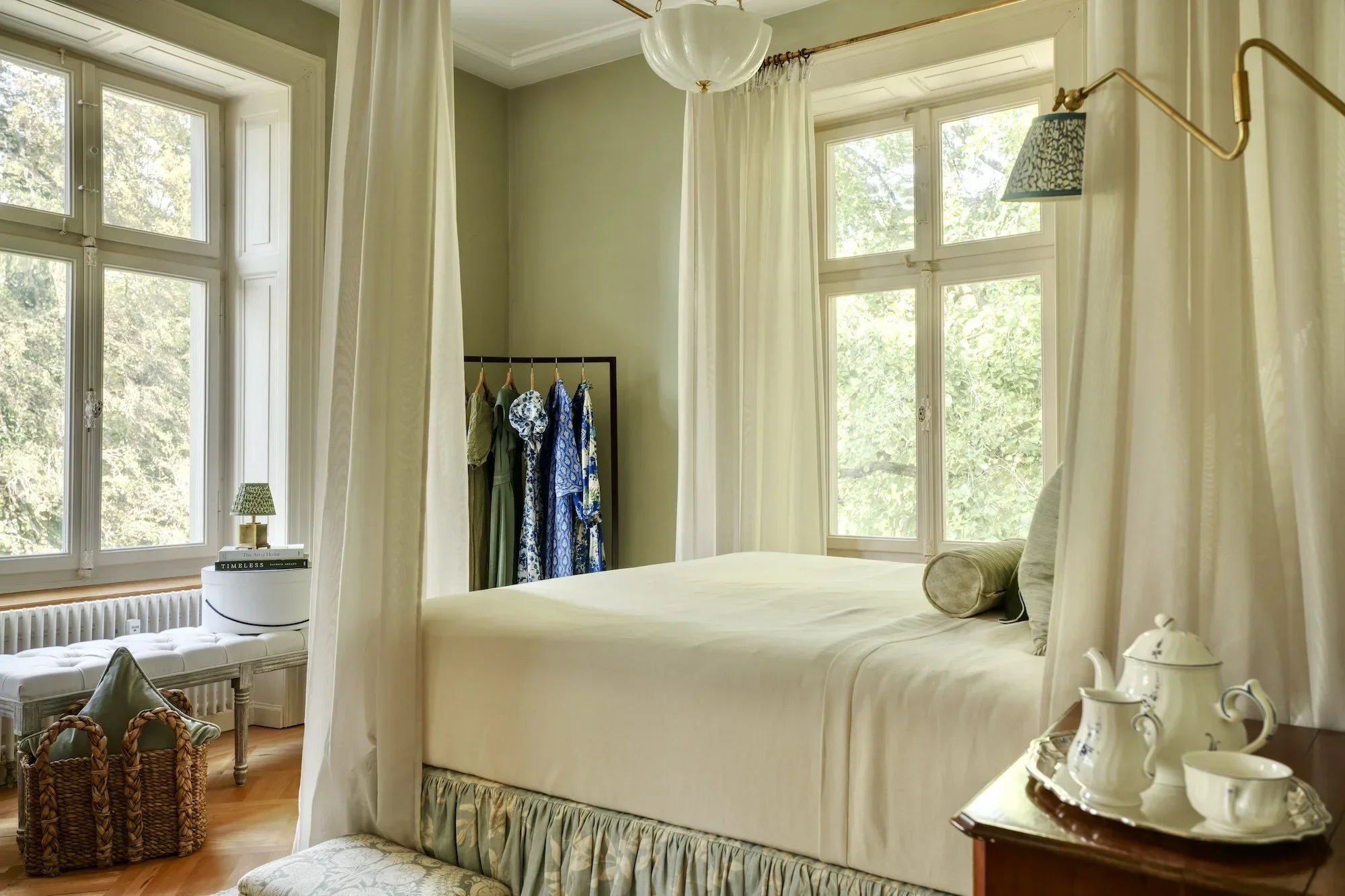
Pattern spread around The Dove: the bed skirt, a patterned lampshade by the window and another on the wall light, with a plain voile canopy as a resting place.
Where to put pattern, and what it costs
Pattern can go almost anywhere: walls, curtains, upholstery, cushions, lampshades and rugs. Some places are simply more expensive to fill with pattern than others, and knowing which is the key to spending well.
Curtains: the biggest investment and the biggest impact. Generous, lined and interlined curtains in a designer fabric take a great deal of fabric, so they cost the most. They also change a room more than anything else.
Wallpaper: the middle ground. Wallpaper costs less than curtains for most rooms, and because walls make up so much of what you see, it fills the whole volume of the room with pattern.
Single pieces: a focused way to bring in a hero fabric. A skirted tablecloth, a headboard and bed skirt, one armchair, or the lampshades bring designer pattern into a room with far less fabric.
Where to spend. Put the budget into the florals and organic prints, because that is where the quality of a designer fabric shows. Stripes matter less, and they are a very good way to get pattern onto a large piece for less. Curtains or a reupholstered sofa in a stripe can cost far less than the same piece in a printed floral, and still bring the impact of pattern.
View this post on Instagram
Floral curtains and a patterned rug in the drawing room of Sims Hilditch's Oxfordshire Country Home.
Patterned wallpaper with patterned curtains
Yes, the two can share a room. The simplest way to make it work:
make one geometric and the other organic;
use slightly different scales;
let them share at least one colour. They don't need every colour in common, but one should be similar.
How much pattern does each room take?
There is no fixed number. Rooms with plenty of soft furnishings can carry the most pattern, so bedrooms and drawing rooms take a similar amount: curtains, upholstery, cushions, a headboard, lampshades. A small bedroom will take fewer patterns than a large drawing room with several seating areas.
View this post on Instagram
Patterned curtains and cushions in a bedroom of Sims Hilditch's South Kensington Family Home.
Rooms with fewer soft surfaces, such as a study, a kitchen or a bathroom, take less, simply because there are fewer places to put it. There, pattern tends to go onto the walls, a blind, a lampshade or a chair.
The confident option: one pattern everywhere
The busiest look of all is the same pattern on the walls, the curtains, the upholstery and the cushions. It is a confident move, and it looks wonderful. A room like this feels unmistakably designed.
It is also, surprisingly, one of the simplest schemes to put together. Once you find a design you love that comes in both a wallpaper and a matching fabric, most of the decisions are made for you.
View this post on Instagram
One pattern on the walls, the curtain and its pelmet, in a powder room by Hughes and Lutz Interiors.
Trimmings: the quiet way to tie a scheme together
Piping, contrast welts, braids and fringes help combine patterns and colours. If a pink slipcovered sofa needs to sit in a green room, a green trim on the slipcover ties it in.
In The Dove, the tablecloth is finished with a bullion fringe from Colefax & Fowler in a mix of beige, green and blue, which picks up every colour in the room in one detail. Trims add a great deal for a modest outlay.
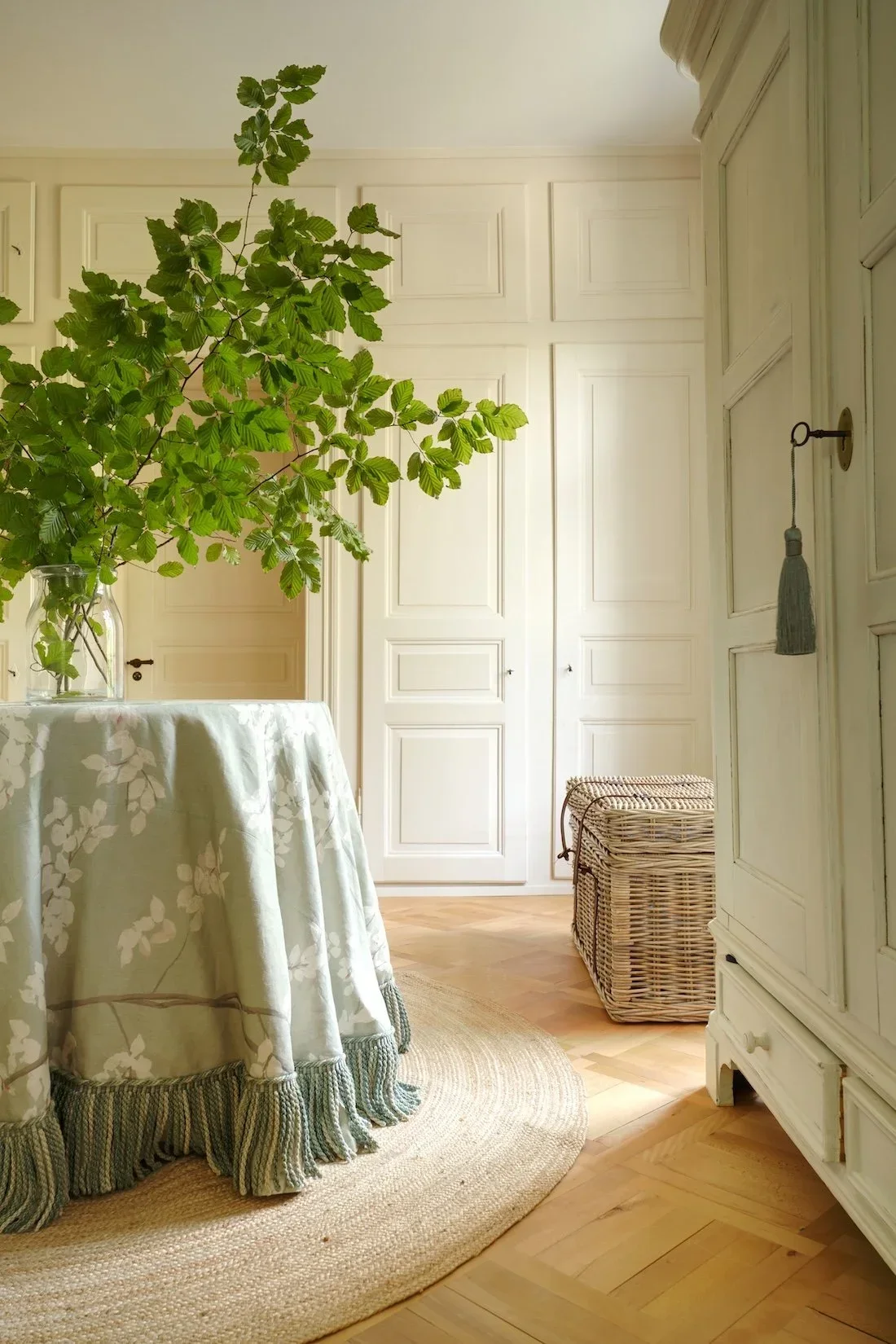
A skirted table in Lewis & Wood Beech in Jade, finished with a Colefax & Fowler bullion fringe in beige, green and blue.
How to test a combination before you buy
Always order samples. Many fabrics look completely different on screen than they do in person. Even a small cutting will tell you what you need to know: the true colour, the weight of the fabric, and how it feels. Lay your samples together, with the anchor in the middle, before anything is ordered.
When I work with clients, this sampling stage is where most of the decisions are made. Through our Online Design service, wherever you live, you receive a complete fabric and paint schedule for your room. For homes in Switzerland, Full Service Design takes the scheme from the first samples to the finished, installed room.
The fabric and wallpaper houses we return to
These are some of the fabric and wallpaper houses we return to most often. It is far from an exhaustive list, but they are a good place to start:
Lewis & Wood. Their designs are some of the most distinctive available, at a time when many fabric ranges start to look alike. Favourites include Doves, Beech, Berry Brothers, Fan Flower and Squawk.
Colefax and Fowler, Soane, GP & J Baker and Pierre Frey. Each is a long-standing source of beautiful florals, stripes and weaves.
Schumacher. We love the Wentworth Embroidery and Cherry Blossom.
Chelsea Textiles, for embroideries and documentary designs.
Fermoie, our go-to for supporting patterns. Their designs come in a great many colourways, often several shades of each colour, so when a scheme needs a small-scale geometric in exactly the right blue, it is almost always there.
For wallpaper, we return to the same houses, along with de Gournay, whose hand-painted and embroidered wallcoverings include favourites such as Coutts, Earlham, Orchard and Osier, and Boråstapeter, the Swedish wallpaper maker.
Three things to keep in mind
Use each colour in several depths, rather than one shade of it across the whole room.
Balance florals with stripes, checks and geometrics.
Vary the scale. If two prints feel as though they are competing, change the scale of one of them.
Do patterned rooms go out of style?
For the people who love this look, it has always been in style and always will be. Pattern may be enjoying a moment in the mainstream, but an English country room is not built around a trend. It is built around pieces you love.
Frequently asked questions
How do you mix patterns in interior design?
Start with one anchor piece that holds several colours, add patterns in different scales and types, repeat the anchor's colours in varying depths, and include a few plain fabrics for the eye to rest on.
How many patterns can you use in one room?
There is no fixed number. A small bedroom takes fewer, a large drawing room with several seating areas takes more. What matters more than the count is a mix of scales and types, with plain fabrics in between.
Can you mix two floral patterns?
Yes, as long as stripes, checks or geometrics sit alongside them, and the two florals differ in scale.
What goes with a floral fabric?
A stripe, a check or a small geometric in one or two of the floral's colours, plus a plain fabric or two for the eye to rest on.
How do you mix patterns without the room looking busy?
Vary the scale, repeat the anchor's colours, and add plain fabrics as resting places. Or embrace a little busyness: a confident, well-planned patterned room is one of the great pleasures of an English country house.
Bringing it all together
A well-mixed room looks collected: a favourite fabric, a stripe that picks up its green, a lampshade in a deeper blue, a fringe that ties them all together. Start with one piece you love, vary the scale and type, repeat its colours in different depths, and give the eye somewhere to rest.
You can see The Dove come together in my bedroom video series, and in the French Gray bedroom post. Here is the finished room:
If you would like a patterned scheme like this for your own home, please do get in touch through Full Service Design for homes in Switzerland, or Online Design wherever you live.
Save this guide to Pinterest.